| |
Although I sit here surrounded by dozens of $50 Dreamweaver, Photoshop,
and Web Design guide books, a lot of this is learned by trial and error
and by meticulous searching newsgroups. |
| |
Page Width (avoid
horizontal scroll bars when possible) This page is now 823 pixels wide to
hold the ruler above but the table holding the text is set at 635 pixels.
Although most pcs can accommodate a setting that wide, the current standard
is 595 and readers would likely have to expand their window for this width.
The following information was gathered in 2001. |
| |
- 595 pixels (Online
Athens). 7% of users set monitor resolution at 640x480, particularly
inexperienced users and those with older PCs. This width prints out
well (more
on printing) although Firefox and Netscape let you reduce the page
to fit your paper.
- 635 pixels (The True Citizen).
The widest resolution for printing on standard paper but creates a small
horizontal scroll bar at 640x480.
- 760 pixels (Arizona Central).
53% of users set monitor resolution at 800x600. This width creates a
horizontal scroll bar on lower resolutions and cuts off right-side data
when printed out.
- 795 pixels (Augusta Chronicle).
This width creates a slight horizontal scroll bar on 15" monitors
even at an 800x600 resolution.
- Larger. 40% of users set monitor resolution at 1024x768 or higher.
Very few sites target that width.
- Variable Width offers less formatting control than fixed width and
is a particular problem when you have images together with text. However,
it permits the page to adjust to a functional printing width.
- Wider page widths usually mean broader headers which increases page
loading time.
|
| |
Page Length |
| |
For maximum impact, web
designers work to eliminate vertical scroll bars (Mendocino
Beacon). I don't believe this is necessary for online papers but do
put the most important news at the top of the page so that it shows onscreen
when the page first loads.
|
| |
Number of Columns |
| |
- Two (Grand
Canyon News)
- Three w/advertising (Pine &
Lakes)
- Three w/no advertising (BBC)
- Four w/advertising (Savannah
Now)
- Four w/no advertising (New York
Times)
- Five (Atlanta Journal-Constitution)
- Avoid rolling text from one column to the next to avoid unnecessary
scrolling.
|
| |
Fonts |
| |
- Arial
10 (Atlanta Journal)
- Times Roman 12
(Bradenton Herald,
body text)
- Variable Width 12 (Washington
Post, body text
- Trebuchet 10 (Juneau
Alaska)
- Comic Sans 10 (this page, may be too casual for newspaper)
- Avoid using too large fonts for headings
- Other fonts may not be on the users PC and won't be readable.
- The best fonts I found for small
buttons were aliased Trebuchet,
Verdana, and
Georgia.
- Use pixels rather than points when designating size.
- An expert's advice
on screen fonts.
|
| |
Justification |
| |
- Left (Coastal
Courier) justification is more useful for readers that open multiple,
over-lapped browser windows and is more professional.
- Center (Key-Biscane)
justification conveys a simple and less professional image.
|
| |
Navigation Bars |
| |
- Left (Holland
Sentinel)
- Right (Amarillo Daily News)
- Top (Portland.com)
- Bottom (Arizona Central)
- Most sites use a combination of all four.
|
| |
Page Size/Loading Time |
| |
Most small-town papers load too
slowly, particulary given that more than 2/3
of all readers are connecting with a modem. Most of the links I put
on this page are larger than 100 kb. Total page size ideally
should be less than 30kb but I shoot for 60kb.
- Small and Attractive (The
Islander, 16kb) but their server is sometimes impossibly slow.
- Quick Enough (Keynoter, 60kb)
- Too Big (Glennville Sentinel,
115kb). I found some above 300kb.
|
| |
Images |
| |
 -
Original drawings or photos add authenticity and professionalism over
clip art. (The True Citizen,
Islander, Keynoter
) -
Original drawings or photos add authenticity and professionalism over
clip art. (The True Citizen,
Islander, Keynoter
)
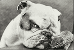
- Keep them small. The gif image at the top is 150 pixels wide and less
than 7kb. This jpg image is 184 pixels wide and less than 8 kb.
- Size them before
you put them on your page. Here's
how to edit your photo using Photoshop (link is to a 234 kb page! That
is why you don't use large photos).
|
| |
Browsers |
| |
I am still working to resolve
differences between the latest versions of
Internet Explorer (IE),
Netscape Navigator
(not 6.0), and Opera.
I have chosen to not worry about older editions of browsers. IE is the
most predictable, which is fortunate because 86%
of all users view the internet with this browser vs. 13% for Netscape.
I use Opera because it is truely faster,
doesn't crash the way Netscape does, and isn't owned by Microsoft. But
I can't get some of my own pages to work right with it. I also wasn't
able to resolve all of my problems with Netscape 4.78 (I don't like 6.0).
|
| |
Site File Structure |
| |
Our first site had all the files
in one folder. Since we maintained no online archive, only had five
pages, and used Netscape Composer for editing, this worked fine. Composer
gets confused when you use subfolders. The
new site is starting off with 20 pages not counting advertising,
is archived online, searchable, and designed with Dreamweaver, requiring
a more complex structure. This structure
seems logical to me based on my reading and was designed to be easy
for someone else to understand.
|
| |
File and Folder Naming Conventions |
| |
To prevent errors, I suggest naming
all files in lower case. The underscore character ( _ ) is acceptable.
Do not use spaces or special characters (e.g. ! @ ~ # $ % ^ & *
: ') in file names. Keep the length of file names to a minimum.
|
| |
Save Time and Money |
| |
- Search Engine: If your site
has less than 500 pages, you can get a free search engine from Atomz
that is incredibly easy to install.
- Calendar: I had my $20 calendar
from htmlcalendar customized
and installed in five minutes. Keeping it updated, however, took too
long so we aren't using it.
|
| |
Automation |
| |
I have explored automated web
publishing systems that take the text from Pagemaker right into html
and have yet to find one affordable to small-town weeklies. Fortunately,
manual 'cut-n-paste' publishing works well and prevents messages like
this which I find daily on my hometown paper: "We
apologize for the inconvenience, but there has been a technical problem
with our Internet publishing system. Please check back soon."
|
| |
Feedback Forms |
| |
Creating forms is easy with Dreamweaver.
Writing the CGI
scripts to make them send the data to the right place was harder
than I wanted to think. While you can write simple code to get the data
to you in e-mail form, that process requires the user to have e-mail
set up correctly on their pc. Get your web site host to help you with
the code.
|
| |
Links for Weekly Newspapers |
| |
- Gebbie
Press
- Weekly Newspapers
Online
|
| |
Other Links |
| |
- Production
Graphics Read the tutorials on menus.
- Technews Online
- Morris Digital Works
- Georgia Press Association
- Editor and Publisher
Online
- Web Pages
That Suck
|
| |
Dreamweaver Advice |
| |
It took me
two days to figure out how to create my headline and byline using H1
and H2 in css.style without putting a blank line between them. To do
this, double click on css.styles, edit H1, select box, margin-bottom:
0; padding-bottom: 0. Then edit H2, box, margin-top: 0; padding-top:
0. I'm still seeing the space in Netscape but it is working fine in
IE and Opera. My thanks to Eric
Meyer for the answer. Also look here
to learn how to do links.
Also, to remove the margin on
this page (notice how my images go right to the edges) I set all margins
in Page Properties at 0.
|